American Airlines
Mobile App, IN-flight Services
American Airlines is the world’s largest airline and is headquartered in the Dallas/Fort Worth metroplex. During this spec project, my team explored how we could expand their current mobile app to increase access and use of in-flight services.

Process
TIMELINE: 2 weeks
TEAM: 3 UX Designers
MY ROLE: Wireframing + Prototyping, Research Assistant, Information Architecture
OUR METHODS: User Interviews, Survey, Data Collection & Synthesis, Competitive Analysis, Sketching, Prototyping, Usability Testing
TOOLS: Whiteboarding, Pencil & Paper, Sketch, InVision, Survey Monkey

Research
COMPETITIVE ANALYSIS:
jetBlue
Offers information on current entertainment directly in app.
No streaming on personal devices.
Delta
Information on entertainment options leads to mobile website.
Users can stream from personal devices through an external app, Gogo.
United
To view in-flight entertainment information, you must leave the app.
Users can stream from personal devices through an external app, Gogo.
SURVEY: 27 Respondents
Key Findings:
We uncovered that majority of airline app users use the app to get onto the flight with check-ins and boarding passes. Most users don’t use the apps while on the flight.

USER INTERVIEWS: 7 Respondents
We wanted to dig deeper than just the in-flight entertainment, so we reached out to frequent flyers to understand their experience with all in-flight services.
Key Questions:
How long is your average flight? How often do you fly?
What are the main reasons you interact with flight attendants?
How do you contact the flight attendants?
What equipment do you use to access in-flight entertainment?
How important is it to customize your in-flight entertainment?
How do you learn about the food and drink options on a flight?
How do you order food and drinks on a flight?
Key Findings:


PERSONA:

USER JOURNEY:
We mapped out Michelle’s in-flight experience as it exists now and how we aim to improve it with our redesigned app concept.

PROBLEM STATEMENT:
We have observed that the current American Airlines mobile app does not enable users to access in-flight services from their personal devices after take-off. The result is that American Airlines users are not fully accessing all of the in-flight amenities.

Ideation
BRAINSTORMING:
We then started to brainstorm on the user flow and the site map to narrow our scope and determine which features would best improve our users’ in-flight experience.
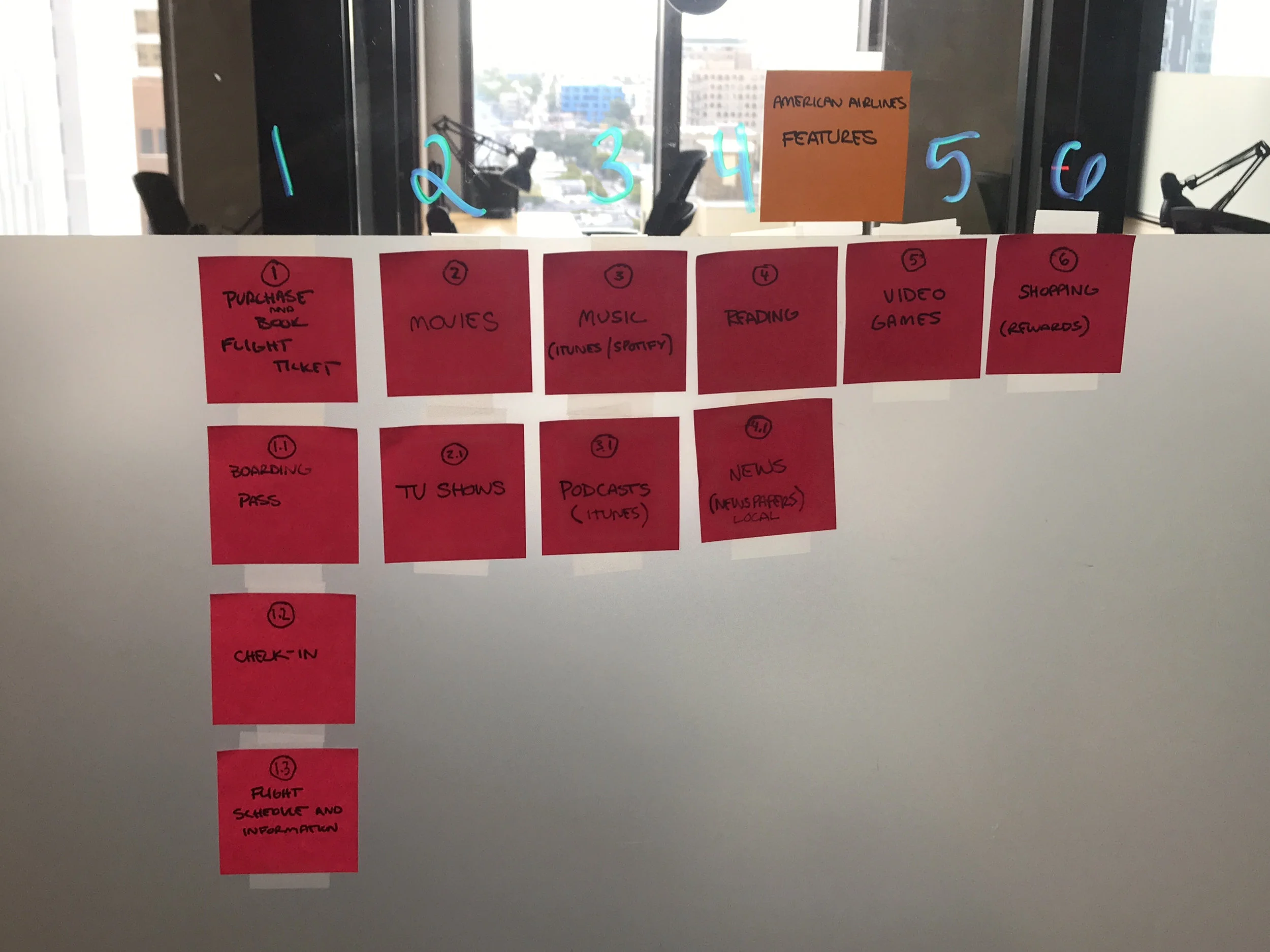
Determining the scope of the app based on importance to the users.

Brainstorming the site map.
SITE MAP:
Once we decided on the features for the app and had a general idea for the app, I created our site map. I used this to help get a clear picture of our information architecture and what pages we needed to create.

SKETCHING:
With our information architecture figured out, we began sketching ideas for our screens. Below are some ideas I sketched for two of our features, the movie and dining section.

WIREFRAMING & PROTOTYPE
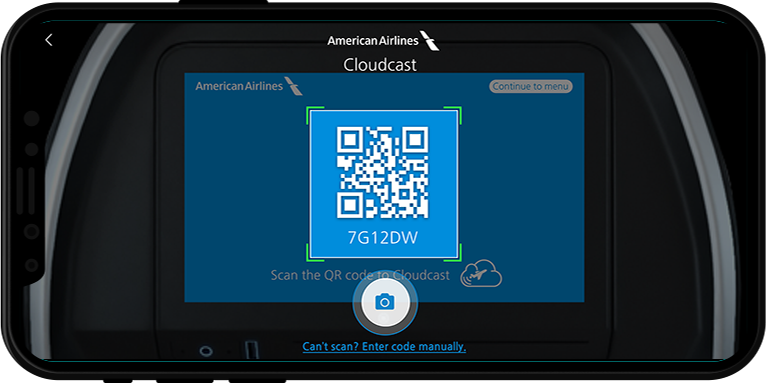
We wanted our users to interact with the app throughout the flight. Not just using it to check in or browse entertainment. We needed to figure out a way for passengers to continue using the app while watching a movie or television show.
We also wanted to keep in mind the television screens many airplanes have on the back of the seat.
Our solution was to use QR Scanning to allow users to “Cloud Cast” their entertainment selection to play on the screen on the seat back in front of them. This feature also allows users to minimize the entertainment section and continue to explore the app.


A status bar will appear at the bottom of the app when users minimize the entertainment selection. The status bar allows users to quickly play/pause or navigate back to their selection.
The wireframes below show how a user might explore the app while “Cloud Casting” a movie.

Check out the full wireframe prototype I created in InVision.

Testing
USABILITY TESTING:
We aimed to have 3-5 testers and gave each participant 3 tasks to complete in 30 minutes.
Tasks:
Task 1: Find the movie “Black Panther” and Cloud Cast onto the screen on the seat back.
Task 2: Add a drink and a food item to the basket and checkout. Apply any rewards you have available.
Task 3: Purchase a featured item from Sky Mall.
Key Findings:


SECOND ITERATION:
To incorporate this feedback into our app, I made a second iteration of the key wireframes.
To help users understand they can leave the Cloud Casting screen, we changed the wording of the back button. Rather than just saying “Black Panther”, it now prompts the user to “Minimize to Explore App.” Adding the word “minimize” lets users know that they won’t be stopping the movie by leaving the screen.

We also added the Cloud Casting button directly to the movie page so users can skip a step and start Cloud Casting right away. We also included an information bubble to teach new users what the button is for.
The dining section included a few changes in the second iteration. I started off by making the Cart popup take up most of the screen instead of being a small bubble pushed to the right. I also added some color to indicate that the rewards were selected and applied to the order.


Design
STYLE GUIDE:
American Airlines has an established a style with three main colors and a standard font. To make the app consistent with their current products, we did not stray too far from the iconic blue, red and white shades. Our visual designer added shades of the current colors as well as a green and a black.
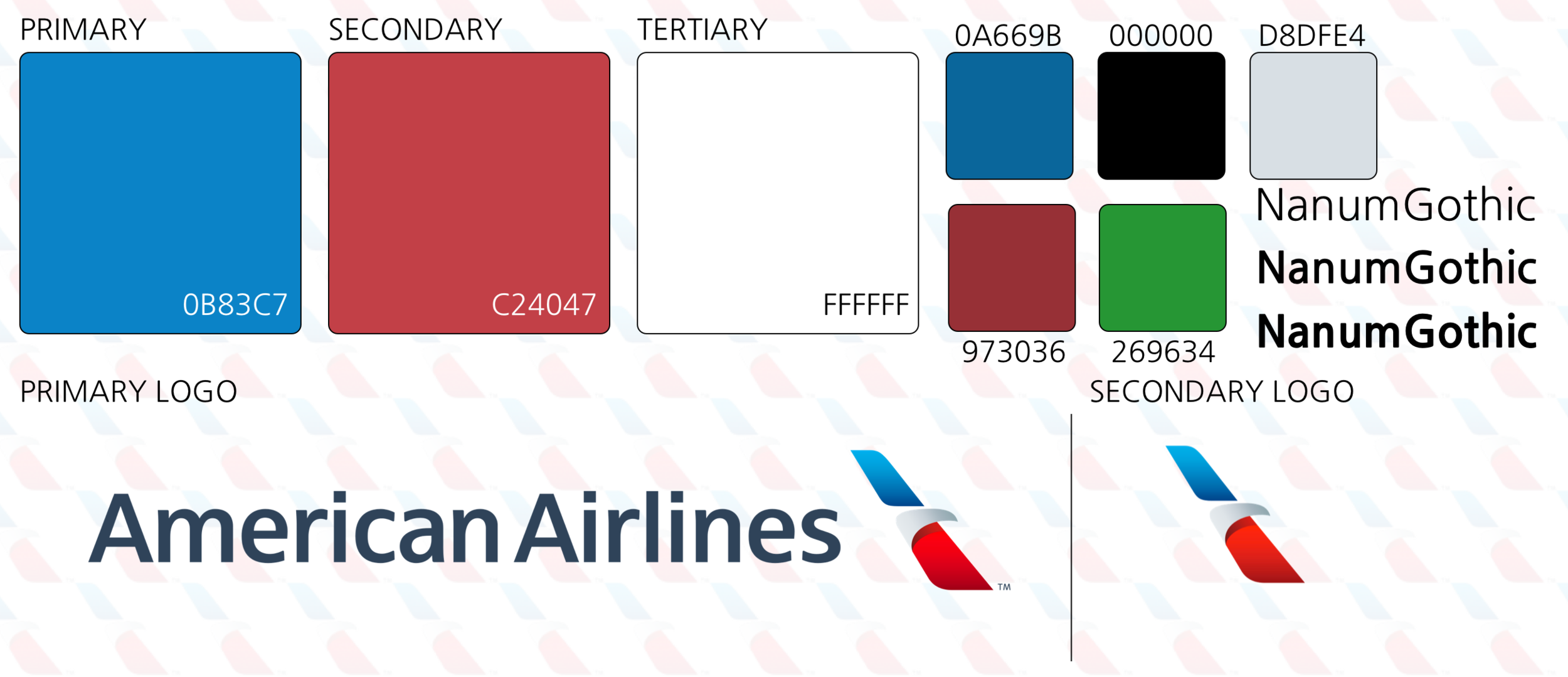
Created by the Lead Designer
HI-FIDELITY PROTOTYPE:


During this project, my team and I learned the importance of challenging our assumptions and biases. Flying on a plane is a common activity that each of us had experienced before. However, we could not assume that we knew what our users needed without completing the research.
We also learned the importance of narrowing down the scope of a project to avoid “feature-itis”, or adding an excessive amount of features to your product. At the beginning of the project, we focused heavily on the entertainment aspect. We wanted to allow users to connect to their personal profiles on sites like Spotify, Netflix, Amazon, etc. To make the app more realistic and valuable to users, we needed to step back and learn more about what other in-flight experiences our users experienced pain points with.
Next Steps & Lessons Learned
NEXT STEPS:
During this project we did not have the time to fully explore our “Contact Flight Attendant” feature. This was feature we were very interested in because we realized from our research that passengers typically wait for a flight attendant to walk by if they need something. This feature will also improve accessibility for passengers who may need assistance.
I made some wireframes to illustrate our thought process for this feature. On this section of the app, we have common questions users might ask during a flight. If passengers do not see their question, they can also choose the “Other” option and still contact the flight attendant.
