
Federation of State Medical Boards (FSMB)
USER Research and information architecture redesign
FSMB aims to protect the public through proper licensure, discipline and regulation of physicians. The goal for this project was to provide an optimized layout and information architecture of the Physician Services Portal homepage to ensure that users understand the path to licensure.

Process
TIMELINE: 3 weeks
TEAM: Meagan Thompson
MY ROLE: User Research, Information Architecture, Wireframing + Prototyping
MY METHODS: User Interviews, Data Collection & Synthesis, Sketching, Prototyping, Usability Testing
TOOLS: Whiteboarding, Pencil & Paper, Sketch, InVision

Research
USER INTERVIEWS:
For this project, I utilized user proxies, listened to customer service calls and interviewed a physician currently trying to use the Physician Services Portal. These methods allowed me to understand the pain points of the physicians. The user proxies were employees of the customer service department who interact with and answer questions for the end users. FSMB has two sectors of their customer service department to better help physicians at different phases in their path to licensure.
Limitations:
Customer service representatives may have inherent biases
Information is skewed towards users who have issues navigating the Physician Services Portal.
Assessment Customer Service Team: 4 Proxy Interviews, 3 Customer Service Calls
This team works with recent medical school graduates and other physicians who need to register for exams or request their exam transcripts.
Key Findings:


FCVS Team: 4 Proxy Interviews, 8 Customer Service Calls, 1 user interview
This sector of the customer service team helps physicians who have completed all of their required exams and are applying to get their Federation Credentials Verification Service (FCVS) document that verifies their credentials for various state medical boards.
Key Findings:


Research Synthesis
AFFINITY MAPPING:
After the interviews were complete, I assigned each respondent a color and wrote down observations on sticky notes. Then I organized the observations into groups to see if any themes appeared.
Themes:
Not sure what is included in FCVS
Unclear information on Physician Services Portal
Technical or Navigation Issues
Confused on where they are in the process
No time to read
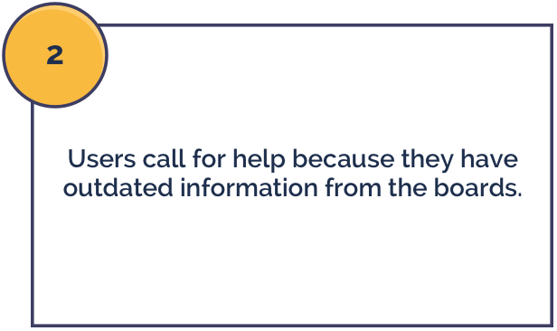
Unclear or confusing information from the boards
PERSONAS:
With the information gathered from the user interviews, I created two personas to represent the users at different phases in their pathway to licensure. The first persona represents a physician who is finishing up their medical residency and is beginning the process of verifying their credentials.

The second persona represents the users who are either finished or close to finishing medical school. These users are coming to the Physician Services Portal to register for their final USMLE exam.

PROBLEM STATEMENT:
We have observed that users are confused by the steps they need to take to become licensed, which often results in frustration and purchasing the wrong services. How might we improve the portal so that users have a clear idea of the services they need to complete next?

Ideation
BRAINSTORMING:
To begin the design process, I sketched out a few ideas to solve two of the biggest problems: users not knowing where they are in the process and the barrier of logging in to get information.
These two problems led me to create a way for the users to access help and information whether or not they were able to log in. If the user is able to log in, they would be able to get more detailed information specific to them. If the user is not able to log in, they will still be guided through the process and pointed in the direction of their next steps.

If users are able to log in, they will get customized help to show them which step they need to complete next.

If users have issues logging in, they can still receive help by answering a few questions about themselves.
FIRST DESIGN ITERATION:
The first iteration of designs were focused on small improvements FSMB could implement quickly. I focused on four key issues:
Users are confused about where they are in the process.
Logging in can be frustrating to users.
Users were unclear about what FCVS includes.
Users skim the information and do not notice or recognize buttons.

Solutions:
Give the user the ability to get help whether they are logged in or not. If they are logged in, they will get a custom experience telling them which step they need to do next. If they are not able to log in, the user can answer a few, short questions about themselves and they will be told which step they need to complete next.
In the Credentialing Services section, list everything that is included in FCVS.
Remove the “ghost buttons” that are currently on the website and add color contrast, a drop shadow and action words in the labels.
SECOND DESIGN ITERATION:
The second iteration went a little further. I reorganized the portal so that the three sections of services would each have separate pages. When the user first arrives at the Physician Services Portal, they will be able to skim an overview of the three sections of services. They can then explore the one that they think applies to them the most.
Splitting the services into three sections also allows FSMB to give more details on each service without leaving the screen feeling cluttered and overloaded with information. For example, instead of having a button for USMLE Step 3 and a link to learn more, the user can now see a short paragraph of important details and buttons for the three possible actions related to that exam.
If they need help determining where they are in the process, they can select one of the two help paths mentioned above, “My Progress” and “What service do I need?”.

This was the first project that I needed user proxies for. The end users are typically stressed out physicians with busy schedules, which made it very difficult to schedule interviews. User proxies allowed me to hear the pain points of the end users even though I could not speak directly with them. User proxies can be quite useful, but I had to keep in mind that there might be some biases present.
Lessons Learned & Next Steps
NEXT STEPS:
I believe the most valuable thing my clients received from the three short weeks was the user feedback during the interviews. A lot of the issues that I uncovered during the user interviews were very apparent once we sat down with the user proxies and listened to the customer service calls. This led to many small improvements that FSMB could implement immediately.
If I had more time, I would try to set up more interviews with the actual end users. During my time on the project, we were only able to set up one phone call with a physician. I believe talking directly to the users could give me more insight on the “Why?” behind most of the issues.
I would also go through the user testing process to determine if the changes I made were effective. Then, with the feedback from those tests, I would build a high-fidelity mockup to help guide the FSMB development team through the changes.