SquadSTX
User research and information architecture redesign
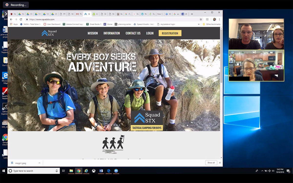
Squad STX is a camping organization for adolescent boys owned and operated by military veterans that focuses on teaching leadership and wilderness skills. My team determined if the value of Squad STX was being conveyed to users and if there were any improvements we could make to the information architecture and registration process.

Process
TIMELINE: 3 weeks
TEAM: 2 UX Designers
MY ROLE: User Research, Wireframing + Prototyping, Information Architecture, Visual Design
OUR METHODS: User Interviews, Survey, Data Collection & Synthesis, Competitive Analysis, Sketching, Prototyping, Usability Testing
TOOLS: Whiteboarding, Pencil & Paper, Sketch, InVision, Survey Monkey, Zoom Video Conferencing

Research
COMPETITIVE ANALYSIS:
We examined the website of four popular summer camps to compare the content and layout to SquadSTX.
Key Findings:
Each website, including SquadSTX, had a homepage that featured a large hero image and call to action for registration.
3 out of 4 of the competitors had a page dedicated to safety information.
All of Squad STX’s competitors had detailed directions or information on the location of the camp.
All of the competitors multiple page, click through registration process with a status bar at the top.
SURVEY:
We reached out to the parents who sent their son(s) to the camp the previous summer. We wanted to get an understanding of the experience the parents had with the site as well as general demographic information.
Key Findings:


USER INTERVIEWS: 5 Respondents
To get first impressions of the current Squad STX website, we reached out to parents who had previously never heard of the camp. We interviewed 5 parents of boys aged 11-15 to get an understanding of what they look for when registering their son for camp.
Questions:
How old is your son?
Does your son participate in extracurricular activities?
Have you sent your son to camp before? If so, which one?
When choosing a camp, what is most important to you?
USER TESTING: 5 Respondents
We also asked the 5 parents to complete a series of tasks on the current website. We used the Zoom video conferencing feature to run the tests. Three respondents completed the test from their desktop, one respondent used an iPad, and the final respondent used their mobile phone.
Tasks:
Tell us your general impression of the organization based on the homepage.
Find the information you would like to know before sending your son to camp.
Register your son for a Squad STX session.

Research Synthesis
AFFINITY MAPPING:
During each user interview and test, we took notes of the respondent’s actions, comments and questions. After the tests were complete, we assigned each respondent a color and wrote down each observation on a sticky note. We then organized the observations from each respondent into common themes.

Key Findings:
We found that there were multiple instances where users were unable to find information they were looking for. The two main reasons we found for this were the information architecture and simply not having it on the website.


PERSONA:
Based on the information gathered from the survey, user interviews and user testing, we produced a primary persona.

USER JOURNEY:
We mapped out Susan’s with the Squad STX website as it exists now to visualize the pain points of the user’s journey.

PROBLEM STATEMENT:
We have observed that Squad STX’s current website is not optimized to enable parents to find key information and register easily, which could result in low attendance. How might we improve the website so that the Squad STX experience and registration process is easily understood by the user?

Ideation
INFORMATION HIERARCHY:
We began our design process by determining the order of information listed on the homepage. During the user interviews, we asked parents what was most important to them when deciding where to send their son to camp. We also observed their actions while going through the user test to see what information they sought out first.
We then arranged the information in order of importance to see what was most important to each person.

With this information, we determined the information hierarchy of the homepage so users can find the information they need quickly and easily.
Activities
Mission/Values
Staff
Safety
Location
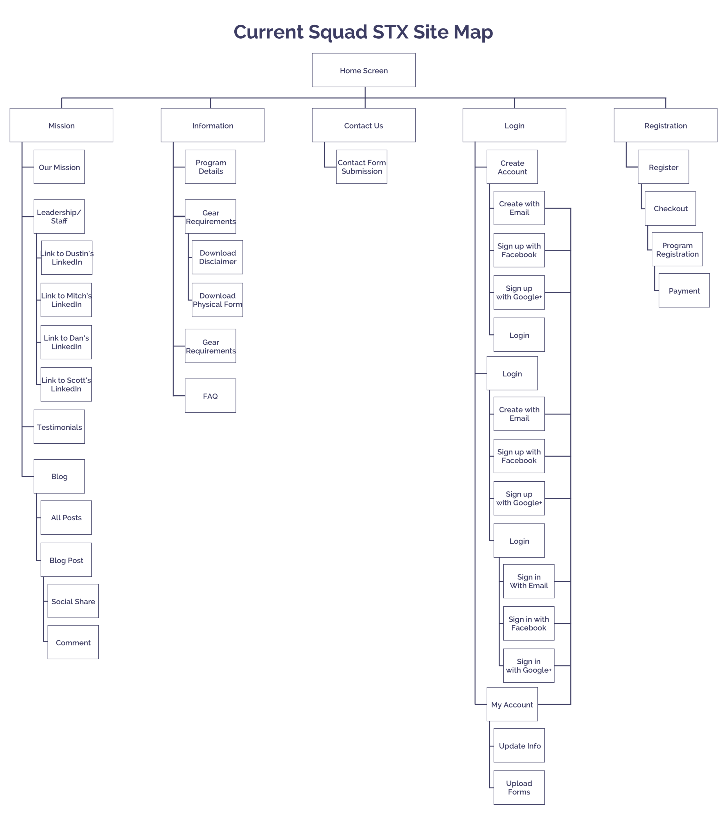
INFORMATION ARCHITECTURE:
Based on our testing, the information architecture of the website needed to be improved to help users find the information they need. We examined the current organization of the site and began brainstorming the new information architecture.


SKETCHING:
We began designing the mobile website first because most of our users access the website from their cell phones.
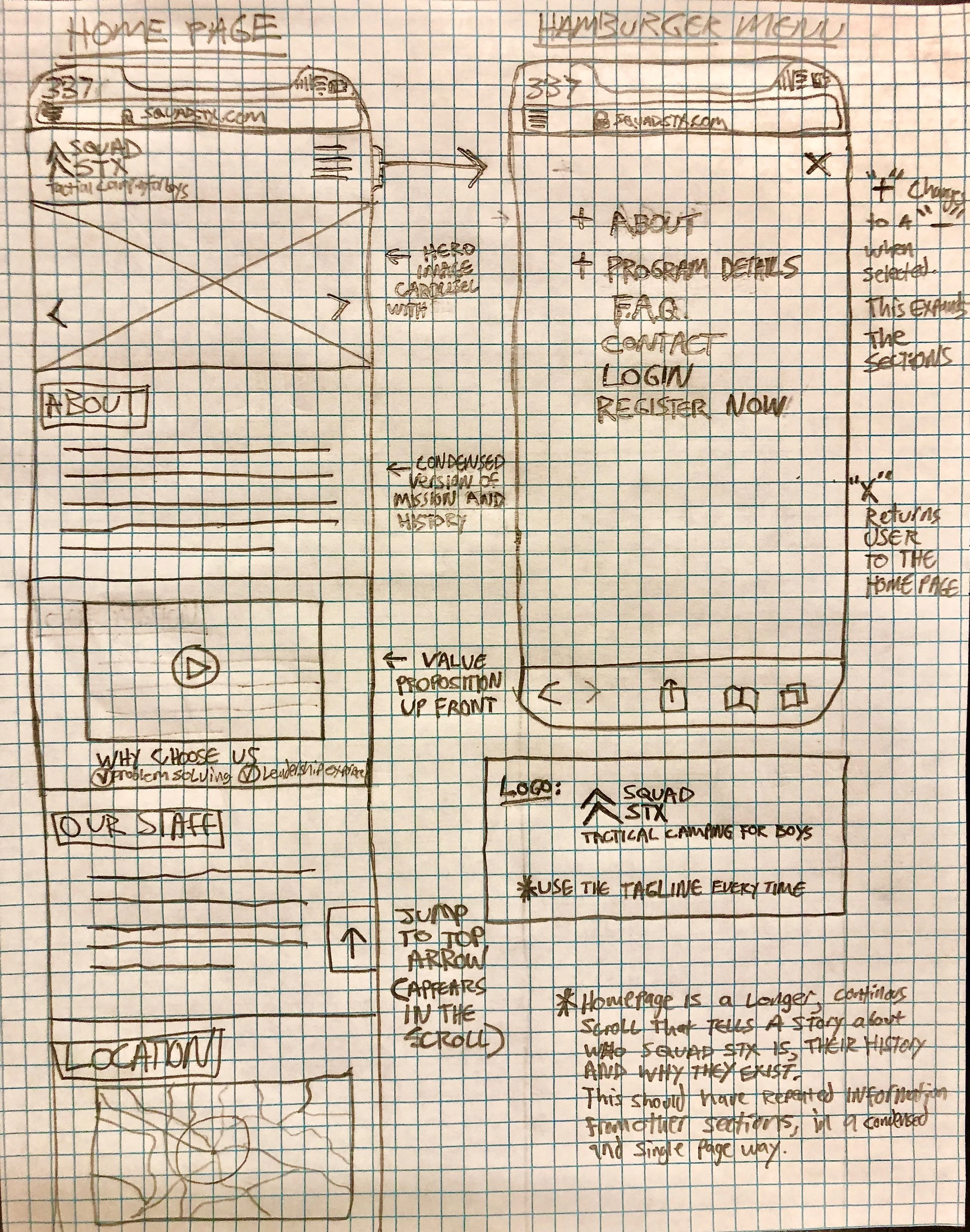

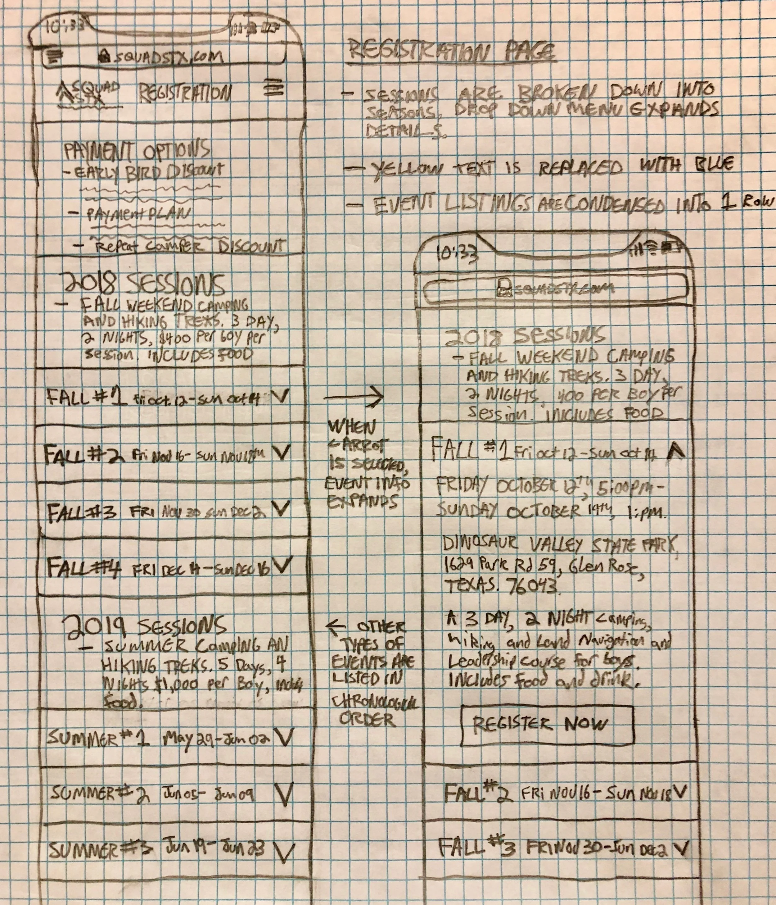
WIREFRAMING & PROTOTYPE
I turned the sketches into wireframes on the Sketch App to create a working prototype in InVision.


Testing
USABILITY TESTING:
Using our wireframe prototype, we had 3 users complete tasks to test the changes to the information architecture.

Tasks:
Find information on what kind of activities would your son participate in at this camp?
Your son has an allergy. Find the information you need to see if he can come to this camp.
Register your son for a Squad STX session.
Key Findings:


Design
MOBILE HIGH FIDELITY MOCKUPS:
Homepage:
Users wanted an overview of what to expect at Squad STX on the Home Page
I placed the information in order of importance/preference of the users
Quick links to more information on the topics allows users to quickly get to the pages they are interested in.

Location Page:
Users had a difficult time finding out where the camp was located.
New location page has video footage and images of the campsite as well as a Google map for directions.
The location page showcases the partnership with the Texas Parks & Wildlife Foundation.

DESKTOP HIGH FIDELITY MOCKUPS:
I made high fidelity mockups for key pages on the desktop site. One important change was the new navigation.
The new navigation shows the improved information architecture and new indicators to show users where they are on the site.
The active page or section will be bright white with a yellow bar. The pages that are not selected will be a a light grey color.

SOLUTION:
By making key improvements to the information architecture and registration process of the Squad STX website, we believe we have optimized the user experience so that parents can quickly find the information they need to register a camper easily.

Future Steps:
In the future, Squad STX aims to have more product offerings. I brainstormed new layout ideas to accommodate for multiple types of sessions and camps.
WIREFRAMES:
Program Details:
“Program Details” turns into “Programs” in navigation and prompts users to choose a type of camp.
New “Program Details” page shows information specific for that camp.
Users can toggle back and forth between types of camps with drop down menu.

Location Page:
Location landing page similar to “Programs” with a landing page that shows all of the different campsites.
Users can select a location they’re interested in learning more about and swipe to see which camps are available there.
